30 Modern CSS Features You’ll Wish You Knew Sooner
Discover 30 powerful, modern CSS features that simplify web development. Learn about CSS Grid, Container Queries, :has(), and more with practical examples.
This post may contain affiliate links. If you make a purchase through these links, we may earn a commission at no additional cost to you.
Ever felt like you’re wrestling with CSS, trying to make things line up just right? You’re not alone. For years, web developers have relied on clever tricks and workarounds to build layouts. But CSS has grown up. It’s packed with powerful new features that make building beautiful, responsive websites simpler and more intuitive than ever before.
Forget the days of float hacks and complex positioning. Modern CSS is like having a super-smart assistant who just gets what you want to do. From creating flexible grids that adapt to any screen size to styling elements based on their neighbours, these features will save you time, headaches, and lines of code.
In this guide, we’ll walk you through 30 modern CSS features you’ll wish you’d known about sooner. We’ll break down what they do, why they’re brilliant, and how you can start using them today. Let’s dive in and transform the way you write CSS.
1-5: Layout and Grids: Taming the Chaos
Building layouts used to be one of the biggest chores in CSS. Now, with Flexbox and Grid, it’s a doddle. These tools let you arrange items in rows or columns with pinpoint control, making complex designs feel effortless.
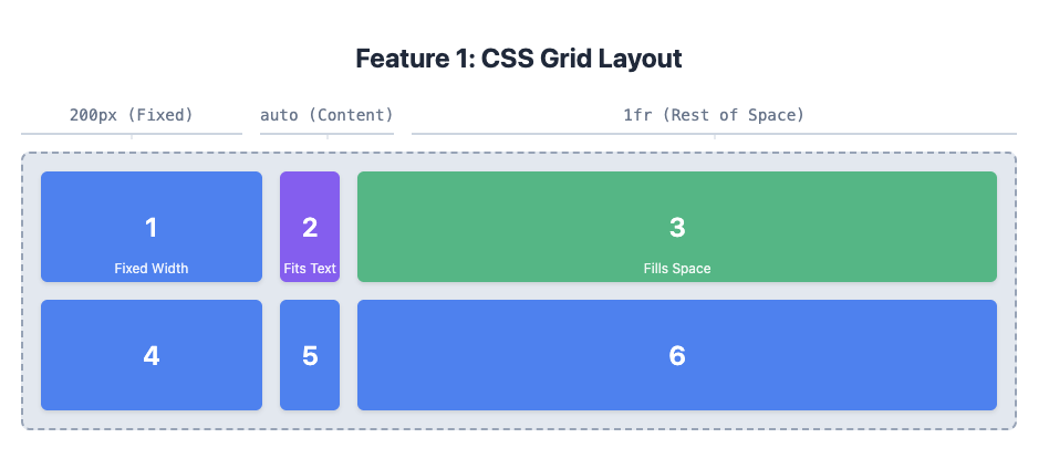
1. CSS Grid Layout (display: grid)
Imagine your webpage is a sheet of graph paper. CSS Grid lets you draw boxes on that paper and place your content exactly where you want it. It’s perfect for creating complex, two-dimensional layouts like magazine spreads or dashboards.
It’s like creating a Sudoku puzzle board for your content. You define the rows and columns, and then you can place any item in any cell.
Grid is a layout system that works in two dimensions: rows and columns. You start by declaring display: grid on a container element. Then, you define the structure using grid-template-columns and grid-template-rows. You can specify the size of each track (a row or column) using pixels, percentages, or the nifty fr unit, which represents a fraction of the available space.
.container {
  display: grid;
  /* Creates three columns: 200px, auto-sized, and one fraction of the space */
  grid-template-columns: 200px auto 1fr;
  /* Creates two rows, each 100px tall */
  grid-template-rows: 100px 100px;
  gap: 1rem; /* Adds space between grid items */
}
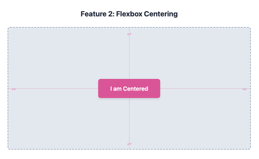
2. Flexbox (display: flex)
If Grid is for two-dimensional layouts, Flexbox is its one-dimensional cousin. It’s designed to arrange items in a single row or column and distribute space among them. It’s brilliant for navigation bars, card layouts, and centering things both vertically and horizontally.
Think of it like a set of books on a shelf. Flexbox helps you line them up, space them out evenly, or shuffle them to either end of the shelf.
When you set display: flex on a container, its direct children become flex items. You can control their alignment, spacing, and order with properties like justify-content (for horizontal alignment), align-items (for vertical alignment), and flex-direction (to switch between rows and columns). Centering an item becomes as simple as this:
.container {
  display: flex;
  justify-content: center; /* Horizontally centres */
  align-items: center;    /* Vertically centres */
  height: 100vh; /* Make container fill the screen height */
}
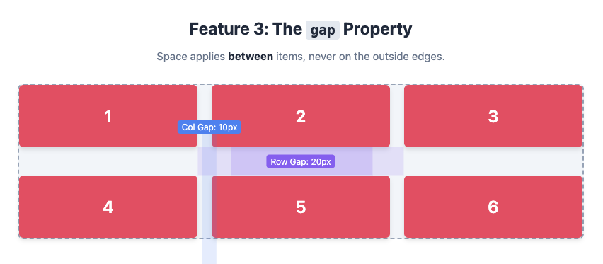
3. The ‘gap’ Property
Remember adding margins to every single item in a grid just to create some space? The gap property solves this beautifully. It lets you define the space between grid or flex items without affecting the space around the container itself.
It’s like putting spacers between your books on the shelf, ensuring they’re all perfectly distanced.
The gap property is a shorthand for row-gap and column-gap. It works in both Grid and Flexbox (though Flexbox support is slightly newer). It’s much cleaner than using margins because it only applies to the space inside the container, between the items.
.container {
  display: grid;
  grid-template-columns: 1fr 1fr 1fr;
  /* Adds a 20px gap between rows and a 10px gap between columns */
  gap: 20px 10px;
}
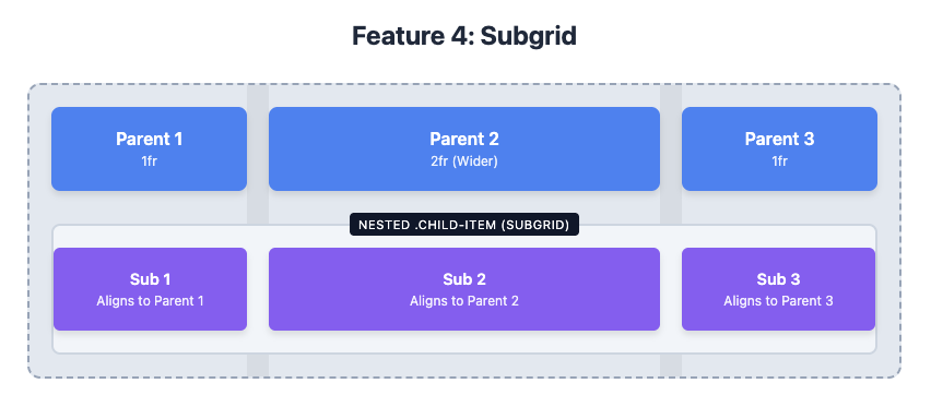
4. Subgrid
Sometimes you have a grid inside another grid, and you want them to align perfectly. That’s where subgrid comes in. It allows a nested grid to adopt the grid tracks of its parent, ensuring everything lines up seamlessly.
Imagine a large calendar grid for the whole month. Subgrid lets you create a smaller grid for a single week that still lines up perfectly with the main calendar’s days.
To use subgrid, you apply display: grid to a nested item and then set its grid-template-columns or grid-template-rows to subgrid. This tells the nested grid to inherit the parent’s track sizing and lines, making it a “sub-grid” of the parent.
.parent-grid {
  display: grid;
  grid-template-columns: 1fr 2fr 1fr;
  gap: 1rem;
}

.child-item {
  /* This item is a grid cell in .parent-grid */
  grid-column: 1 / 4; /* Span all three columns */

  /* Now, make it a subgrid */
  display: grid;
  grid-template-columns: subgrid; /* Inherit the parent's columns */
  gap: 0; /* Gaps are inherited, so you might want to reset them */
}
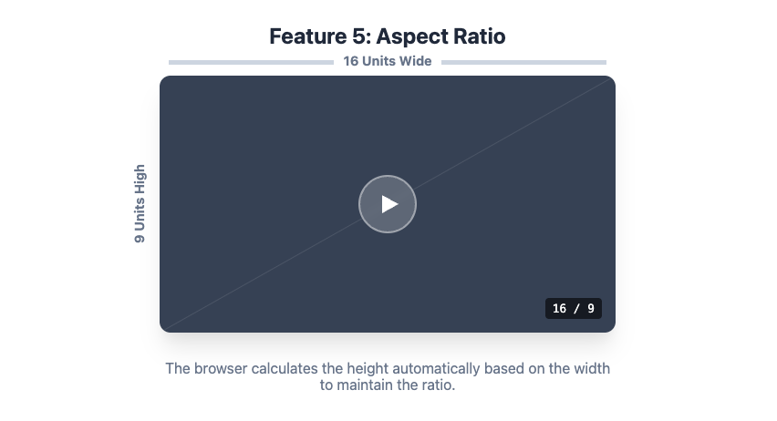
5. Aspect Ratio (aspect-ratio)
Creating elements that maintain a specific aspect ratio (like 16:9 for a video) used to require a clunky “padding hack.” The aspect-ratio property makes this a one-liner.
It’s like telling a photo frame to always stay in a widescreen shape, no matter how you resize it.
You can apply aspect-ratio to any element. The browser will automatically adjust its height based on its width (or vice versa) to maintain the specified ratio.
.video-container {
  aspect-ratio: 16 / 9;
  width: 100%;
  background-color: lightgrey;
}
6-8: Smarter Selectors: Targeting with Precision
CSS selectors are how we tell the browser which elements to style. Modern selectors are incredibly powerful, letting you target elements based on their position, state, or even their relationship with other elements.
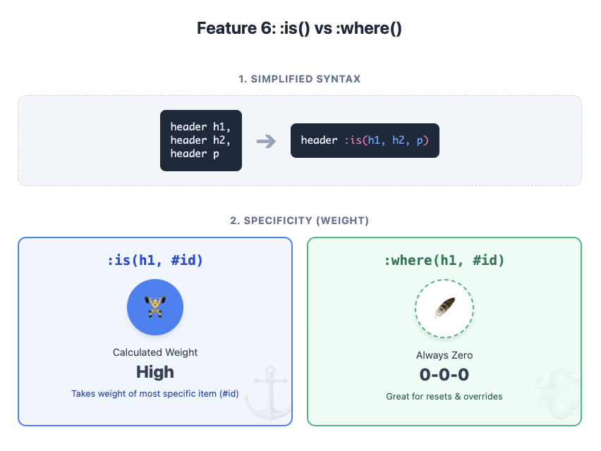
6. The :is() and :where() Pseudo-classes
Ever written long, repetitive selectors like this? header h1, header h2, header p { color: blue; }
:is() and :where() let you group selectors together to make your code much tidier.
They’re like saying, “Style any heading or paragraph that’s inside the header.”
Both :is() and :where() take a list of selectors as an argument. The difference is specificity. :is() takes on the specificity of the most specific selector in its list, while :where() always has a specificity of zero. This makes :where() fantastic for creating low-specificity overrides in a CSS reset.
/* Using :is() */
header :is(h1, h2, p) {
  color: blue; /* Specificity is that of 'header h1' */
}

/* Using :where() */
:where(h1, h2, p).important {
  color: red; /* Specificity is just that of '.important' */
}
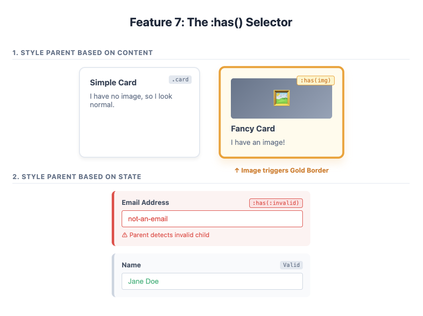
7. The :has() Pseudo-class (The “Parent Selector”)
For years, developers have dreamed of a “parent selector”—a way to style an element based on what’s inside it. :has() is that dream come true. You can style a <div> if it :has() a <p> inside, or style a form field’s container if it :has() an invalid input.
It’s like saying, “If this box has a picture inside it, give the box a golden border.”
:has() is incredibly versatile. It lets you style an element based on its descendants or even subsequent siblings. This opens up all sorts of possibilities that previously required JavaScript.
/* Style a card if it contains an image */
.card:has(img) {
  border: 2px solid gold;
}

/* Add a red border to the form group if the input is invalid */
.form-group:has(input:invalid) {
  border-left: 5px solid red;
}
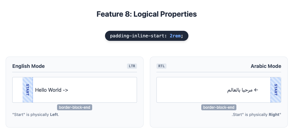
8. Logical Properties (margin-inline, padding-block)
Websites should work for everyone, regardless of their language. Some languages, like Arabic or Hebrew, are read from right to left. Properties like margin-left are physical—they always refer to the left side. Logical Properties are writing-mode aware. margin-inline-start refers to the start of the text, whether that’s the left or the right.
Simplified Explanation: Instead of saying “add space to the left,” you say “add space at the start of the sentence.” The browser figures out where the start is.
Detailed Explanation: Logical properties map to physical properties based on the document’s writing mode.
inlinerefers to the direction of text flow (left/right in English).blockrefers to the direction of blocks (top/bottom in English).
So, margin-inline-start replaces margin-left, and padding-block-end replaces padding-bottom.
p {
  /* This works for both left-to-right and right-to-left languages */
  padding-inline-start: 1rem;
  border-block-end: 1px solid grey;
}
9-12: Dynamic and Responsive Design
Making websites look great on any device is essential. These modern features make responsive design more powerful and intuitive.
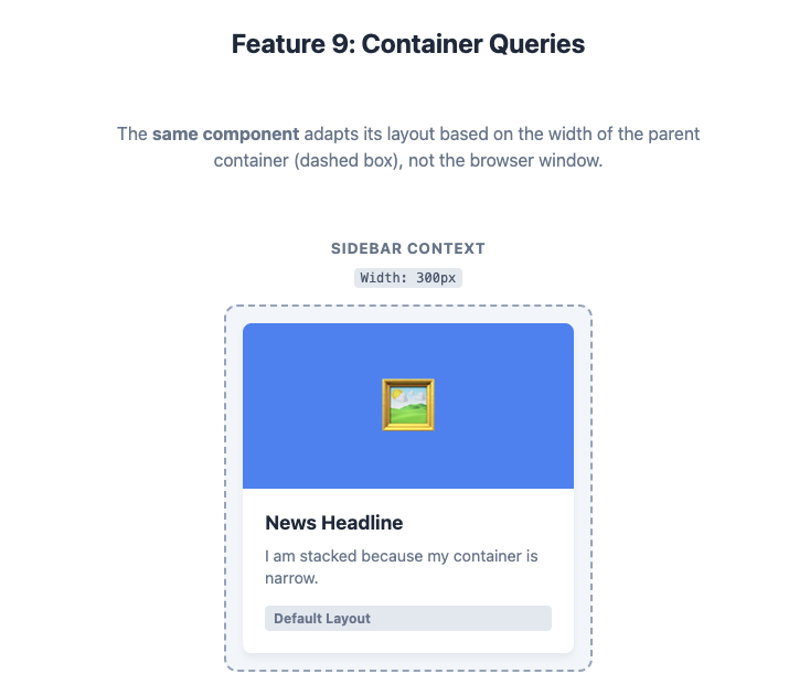
9. Container Queries (@container)
Media queries let you change styles based on the size of the viewport (the browser window). Container Queries let you change styles based on the size of a parent container. This is a game-changer for building reusable components.
Imagine a news article card. With container queries, you can tell it: “If you’re in a narrow sidebar, stack your image on top of the text. If you’re in a wide main section, put the image and text side-by-side.” The component adapts itself to where it’s placed, not just the screen size.
First, you need to designate an element as a query container by setting its container-type. Then, you can use the @container at-rule, which works just like @media, but it queries the container’s dimensions instead of the viewport’s.
/* 1. Define an element as a container */
.card-container {
  container-type: inline-size;
  container-name: card; /* Optional name */
}

/* 2. Style the component based on the container's width */
@container card (min-width: 500px) {
  .card {
    display: flex; /* Switch to a side-by-side layout */
  }
}
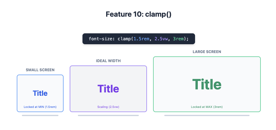
10. clamp() for Fluid Typography
Want your font size to grow smoothly with the screen size, but not get too big or too small? The clamp() function is your answer. It lets you set a minimum, a preferred, and a maximum value for any property.
It’s like setting a thermostat for your font size. You say, “I’d like it to be around 2vw, but don’t let it go below 16px or above 30px.”
clamp() takes three arguments: clamp(MIN, PREFERRED, MAX). The browser will try to use the preferred value (often a viewport unit like vw), but it will never go below the minimum or above the maximum.
h1 {
  /* Font size will be 2.5vw, but never smaller than 1.5rem or larger than 3rem */
  font-size: clamp(1.5rem, 2.5vw, 3rem);
}
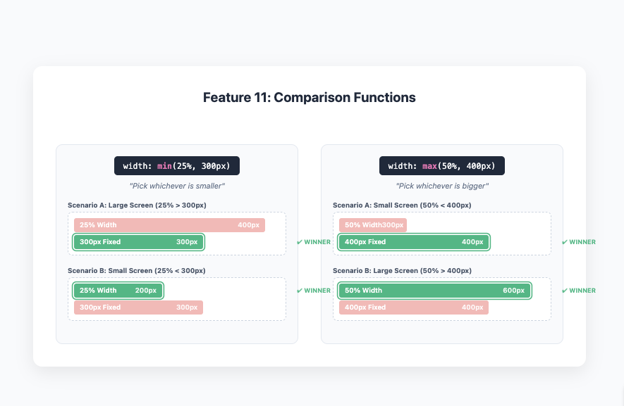
11. CSS Comparison Functions (min(), max())
Similar to clamp(), min() and max() let you pick the smallest or largest value from a list. This is great for setting dynamic sizes that have a hard limit.
min(10vw, 100px) means “use 10vw, but never let it get bigger than 100px.” max(50%, 400px) means “use 50%, but never let it get smaller than 400px.”
These functions are incredibly useful for responsive design. For example, you can set a width that’s responsive but doesn’t exceed a certain pixel value, all in one line.
.sidebar {
  /* The sidebar will be 25% of the parent's width, but no wider than 300px */
  width: min(25%, 300px);
}
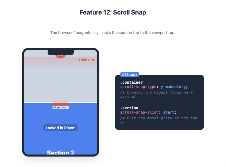
12. Scroll Snap
You know those image carousels or full-screen sections that “snap” into place as you scroll? That’s Scroll Snap. It gives you control over the scrolling experience, making it feel more like a native app.
It’s like adding magnets to your page sections. As you scroll, the browser helps you “snap” perfectly to the start of the next section.
You apply scroll-snap-type to the scrolling container and scroll-snap-align to the child elements you want to snap to. You can control the snapping direction (x, y, or both) and how strictly it enforces the snap.
.container {
  /* Enable vertical scroll snapping, and make it mandatory */
  scroll-snap-type: y mandatory;
  overflow-y: scroll;
  height: 100vh;
}

.container section {
  /* Align each section to the start of the viewport when snapping */
  scroll-snap-align: start;
  height: 100vh;
}
13-17: Colours and Effects: Bringing Your Designs to Life
CSS is no longer just for boxes and text. Modern features allow for beautiful colours, gradients, filters, and clipping effects that can make your site visually stunning.
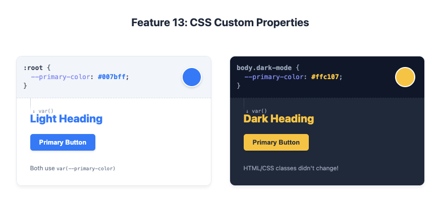
13. CSS Custom Properties (Variables)
If you’ve ever had to find and replace a colour code in dozens of places, you’ll love Custom Properties. They let you define reusable values (like colours or font sizes) in one place and then reference them throughout your stylesheet.
They’re like giving a nickname to a colour. You can define --main-brand-colour: #3498db; once, and then just use var(--main-brand-colour) everywhere you need that blue. If you want to change the brand colour later, you only have to update it in one place.
Custom Properties are defined with a -- prefix and are accessed using the var() function. They are dynamic and cascade just like other CSS properties, meaning you can redefine them inside media queries or different selectors (e.g., for a dark mode theme).
:root {
  --primary-color: #007bff;
  --font-size-large: 1.5rem;
}

body.dark-mode {
  --primary-color: #ffc107;
}

h1 {
  color: var(--primary-color);
  font-size: var(--font-size-large);
}
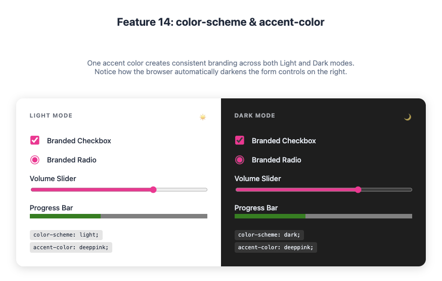
14. color-scheme and accent-color
Creating a dark mode used to involve overriding dozens of styles. The color-scheme property tells the browser that your site supports light and dark themes. The browser will then automatically adjust default colours, like form controls and scrollbars.
accent-color takes this a step further, letting you easily change the colour of UI controls like checkboxes and radio buttons.
color-scheme is like flipping a switch to tell the browser, “Go on, use your default dark theme styles.” accent-color is like telling all your checkboxes and progress bars, “You should all be this lovely shade of green.”
color-scheme: By settingcolor-scheme: light dark;in your CSS, you indicate your site works in both modes. You can then use theprefers-color-schememedia query to apply your own theme-specific styles.accent-color: This property tints UI controls with a single line of code, saving you the hassle of styling them manually.
:root {
  color-scheme: light dark;
  --brand-color: deeppink;
}

@media (prefers-color-scheme: dark) {
  /* Your custom dark mode styles here */
}

/* Style form controls with your brand colour */
input, button, progress {
  accent-color: var(--brand-color);
}
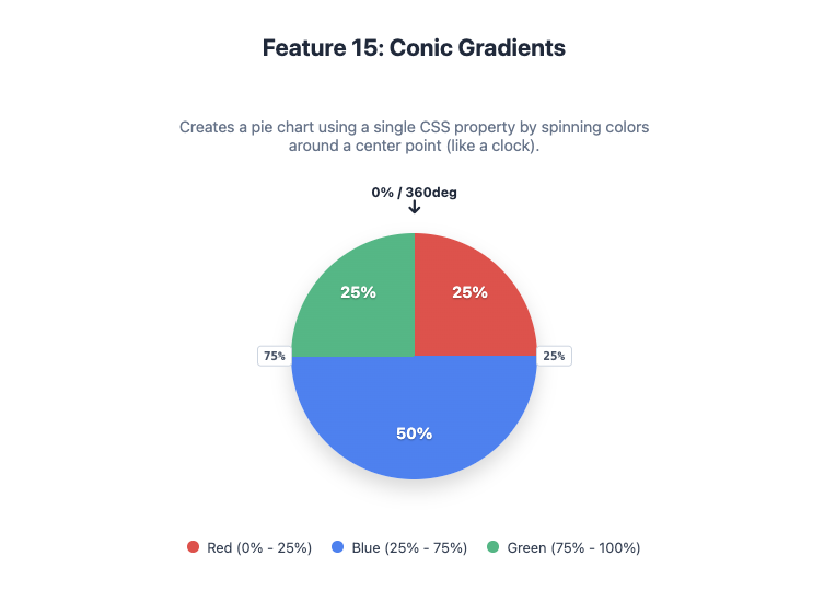
15. Conic Gradients (conic-gradient)
We’ve had linear and radial gradients for ages. Conic gradients create a gradient that sweeps around a central point, like a colour wheel or a loading spinner.
Imagine a clock face where the colour changes as the hand moves from 12 all the way around back to 12.
The conic-gradient() function creates an image that transitions colours in a circle. It’s perfect for creating pie charts, colour wheels, and other circular designs without needing images or complex SVG.
.pie-chart {
  width: 200px;
  height: 200px;
  border-radius: 50%;
  background: conic-gradient(
    red 0% 25%,
    blue 25% 75%,
    green 75% 100%
  );
}
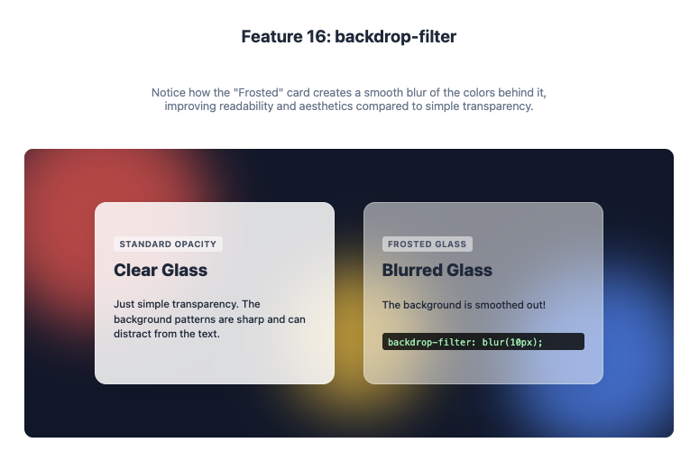
16. backdrop-filter
The backdrop-filter property lets you apply graphical effects like blur() or grayscale() to the area behind an element. This is how you create those trendy frosted glass effects seen in iOS and macOS.
It’s like putting a piece of frosted glass over your webpage. The element itself is clear, but everything you see through it is blurred.
For backdrop-filter to work, the element needs to be semi-transparent (e.g., using an rgba() background colour). The filter is then applied to whatever content is visible behind it.
.modal {
  /* A semi-transparent white background */
  background-color: rgba(255, 255, 255, 0.5);
  /* Apply a 10px blur to the content behind the modal */
  backdrop-filter: blur(10px);
}
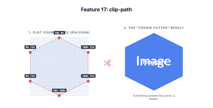
17. clip-path
The clip-path property lets you clip an element to a specific shape, hiding the parts that are outside of it. You can use basic shapes like circle() or polygon(), or even an SVG path for complex shapes.
It’s like using a cookie cutter on an element. You can cut it into a star, a hexagon, or any shape you can imagine.
clip-path creates a clipping region that defines which parts of an element are visible. The polygon() function is especially powerful, as it lets you define a custom shape by plotting its coordinates.
.hexagon {
  clip-path: polygon(50% 0%, 100% 25%, 100% 75%, 50% 100%, 0% 75%, 0% 25%);
}
18-10: Typography and Text
Styling text on the web is becoming more sophisticated. These features give you more control over how your text looks and behaves.
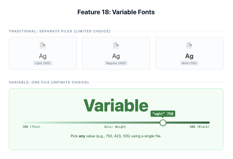
18. Variable Fonts
Traditional fonts have a few set weights (like light, regular, bold). Variable Fonts are a single font file that contains an entire range of styles, like weight, width, and slant. This gives you incredibly fine-grained control over your typography.
Imagine having a “boldness” slider for your text, letting you choose any value from 1 to 1000, instead of just “regular” or “bold”.
You can control the different “axes” of a variable font using the font-variation-settings property. Common axes include weight (wght), width (wdth), and italic (ital). This not only offers more design flexibility but can also improve performance by reducing the number of font files you need to load.
h1 {
  font-family: "MyVariableFont";
  /* Set a precise font weight */
  font-variation-settings: "wght" 750;
}
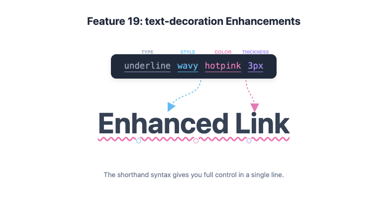
19. text-decoration Enhancements
The text-decoration property used to be pretty basic—you could add an underline and that was about it. Now, you can control the colour, style, and thickness of text decorations.
You can now make your underlines wavy, dotted, or a completely different colour from the text.
text-decoration is now a shorthand for text-decoration-line, text-decoration-color, text-decoration-style, and text-decoration-thickness.
a {
  text-decoration: underline wavy hotpink 3px;
}
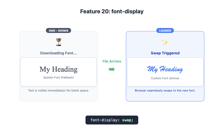
20. font-display
When a webpage loads a custom font, what happens before the font file arrives? The font-display property lets you control this behaviour, helping you avoid the dreaded “flash of invisible text.”
It tells the browser how to handle text while it’s waiting for a fancy font to download. For example, you can tell it, “Show a fallback system font immediately, and then swap to the fancy one when it’s ready.”
font-display is used inside your @font-face rule. The most common value is swap, which tells the browser to show the text immediately with a fallback font and then swap in the custom font once it has loaded. This is great for performance and user experience.
@font-face {
  font-family: 'MyCustomFont';
  src: url('mycustomfont.woff2') format('woff2');
  font-display: swap;
}
21-23: Animation and Interaction
Modern CSS allows for smooth, performant animations and interactions without needing a single line of JavaScript.
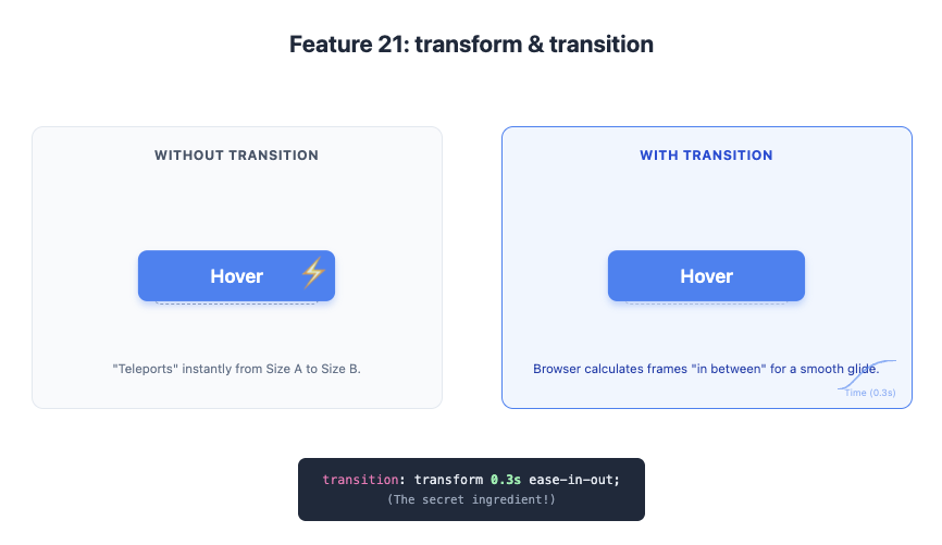
21. CSS transform and transition
The transform property lets you modify an element’s shape, size, and position. You can scale() it up, rotate() it, translate() (move) it, or skew() it.
When combined with the transition property, you can animate these changes smoothly over time.
transform is how you move or twist an element. transition is what makes that movement smooth instead of instantaneous. It’s the difference between an object teleporting and gracefully gliding across the screen.
It’s much more performant to animate transform and opacity than properties like top, left, or margin. This is because the browser can offload these animations to the GPU, resulting in a smoother experience.
.button {
  transition: transform 0.3s ease-in-out;
}

.button:hover {
  /* Grow the button slightly on hover */
  transform: scale(1.1);
}
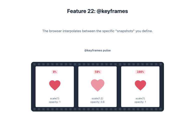
22. CSS animation and @keyframes
For more complex, multi-step animations, you can use the animation property along with the @keyframes at-rule. This lets you define specific steps in an animation sequence.
@keyframes is like creating a flip-book animation. You define what the element looks like at the start (0%), in the middle (50%), and at the end (100%), and the browser fills in the gaps.
Inside a @keyframes rule, you define the styles for different points in the animation’s timeline. Then, you apply this animation to an element using the animation property, where you can specify its duration, timing function, and iteration count.
@keyframes pulse {
  0% {
    transform: scale(1);
    opacity: 1;
  }
  50% {
    transform: scale(1.05);
    opacity: 0.7;
  }
  100% {
    transform: scale(1);
    opacity: 1;
  }
}

.heart-icon {
  animation: pulse 2s infinite;
}
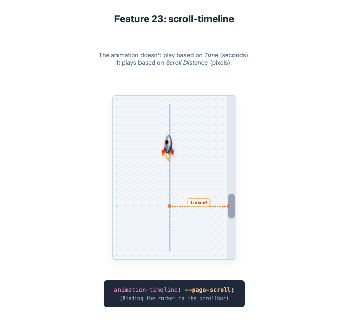
23. scroll-timeline (Coming Soon)
This is an exciting one that’s just on the horizon. scroll-timeline will let you link an animation’s progress to your scroll position. As you scroll down the page, you can make elements fade in, move, or change size.
Imagine a rocket that flies up the side of the page as you scroll down. Its journey from the bottom to the top is tied directly to your scrollbar.
Instead of being tied to time, an animation’s progress will be tied to the progress of scrolling within a container. This will make it possible to create stunning, scroll-driven animations purely with CSS, which are currently only possible with complex JavaScript.
/* Future syntax example */
.rocket {
  animation: fly-up linear;
  animation-timeline: --page-scroll; /* Link animation to page scroll */
}

@scroll-timeline --page-scroll {
  source: auto;
  orientation: vertical;
}
24-30: Miscellaneous but Marvellous
Here are a few more modern features that solve common problems and make writing CSS more enjoyable.
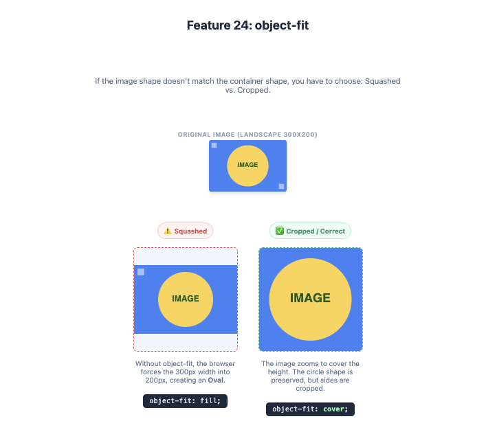
24. object-fit
Ever tried to fit an image into a container without stretching or squashing it? The object-fit property solves this. It tells an image how it should resize to fit its container, similar to background-size.
It’s like telling an image, “Fit inside this box, but don’t lose your shape. Just cover the whole area and let the edges get cropped off if needed.”
object-fit can take several values:
cover: The image covers the entire container, cropping as necessary.contain: The entire image is scaled down to fit inside the container.fill: The image is stretched to fill the container (the default).none: The image is not resized.
img {
  width: 100%;
  height: 200px;
  /* Ensures the image covers the container without distortion */
  object-fit: cover;
}
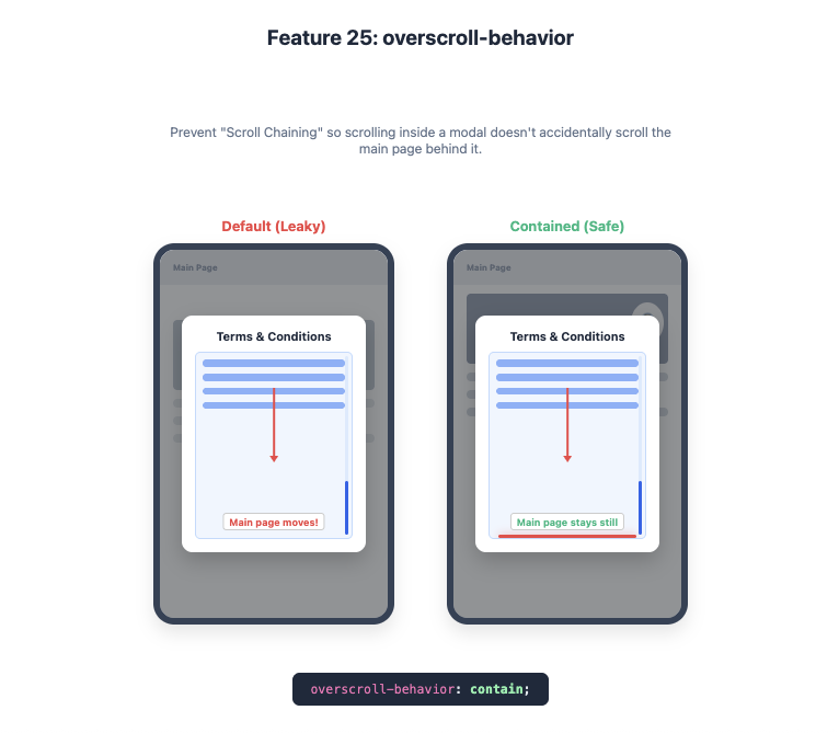
25. overscroll-behavior
You know when you’re scrolling a modal, and once you reach the end, the whole page behind it starts scrolling? This is called “scroll chaining.” The overscroll-behavior property lets you prevent this.
Simplified Explanation: It’s like putting a boundary around a scrolling box, so that when you hit the bottom, your scroll stops there instead of continuing onto the main page.
Detailed Explanation: Setting overscroll-behavior: contain; on an element will prevent scroll chaining. This is fantastic for modals, chat windows, and other scrollable components within a page.
.modal-body {
  overflow-y: scroll;
  overscroll-behavior: contain;
}
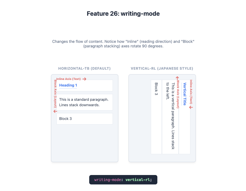
26. writing-mode
The writing-mode property allows you to change the direction of text flow, for example, to display it vertically. This is essential for supporting languages with vertical scripts, like Japanese, but it can also be used for creative typographic effects.
It lets you turn your text on its side, so it reads from top to bottom.
writing-mode can be set to horizontal-tb (the default), vertical-rl (top to bottom, right to left), or vertical-lr (top to bottom, left to right). This affects not just the text but also the layout direction for Flexbox and Grid.
.vertical-title {
  writing-mode: vertical-rl;
  text-orientation: mixed; /* Keeps characters upright */
}
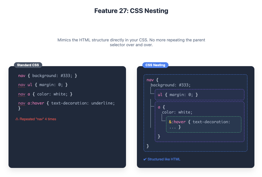
27. CSS Nesting
A long-awaited feature inspired by preprocessors like Sass. CSS Nesting allows you to nest style rules inside other rules, making your CSS more organised and readable.
Instead of writing separate rules for a nav and the a tags inside it, you can just put the a rule directly inside the nav rule.
Nesting helps co-locate styles for a component, reducing repetition and making the code easier to maintain. The & symbol is used to refer to the parent selector.
nav {
  background-color: #333;

  ul {
    list-style: none;
    margin: 0;
    padding: 0;
  }

  a {
    color: white;
    text-decoration: none;

    &:hover {
      text-decoration: underline;
    }
  }
}
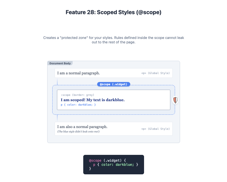
28. Scoped Styles (@scope)
Sometimes you want to apply styles to a specific section of your page without them “leaking” out and affecting other elements. @scope allows you to scope your styles to a specific part of the DOM tree.
It’s like putting a fence around a component’s styles, so they only apply inside that component and don’t mess with anything else on the page.
@scope lets you define a “scoping root,” and the styles within the block will only apply to elements within that root. This is a huge step forward for writing encapsulated, component-based CSS without relying on complex naming conventions or JavaScript frameworks.
/* Styles in this block will only apply within the .widget component */
@scope (.widget) {
  :scope { /* :scope refers to the .widget element itself */
    border: 1px solid grey;
  }

  p {
    color: darkblue;
  }
}
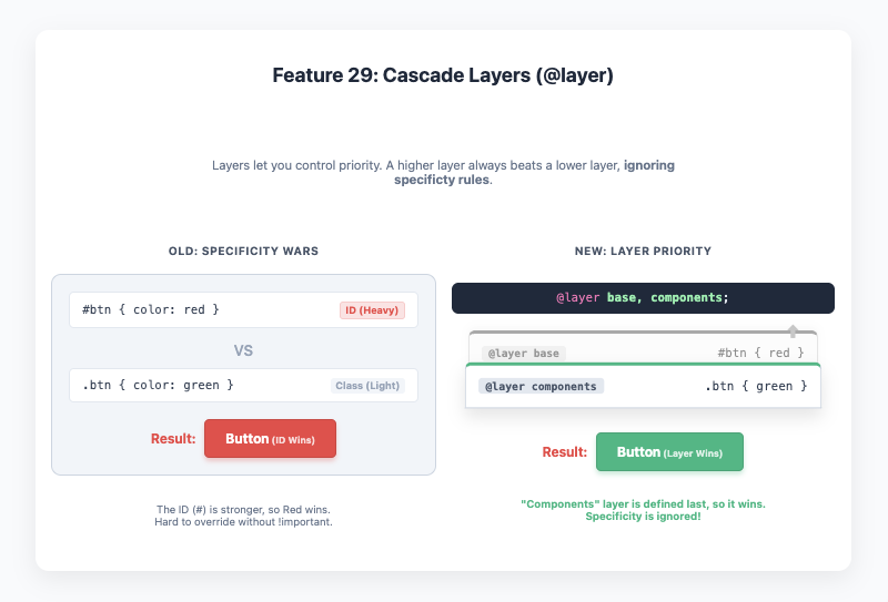
29. Cascade Layers (@layer)
The CSS cascade can be tricky. Sometimes, the order of your stylesheets or the specificity of your selectors can lead to unexpected results. Cascade Layers give you direct control over the cascade, allowing you to define which styles have priority.
It’s like creating filing cabinets for your CSS. You can have a ‘reset’ layer, a ‘framework’ layer, and a ‘components’ layer. Styles in a later layer (components) will always override styles in an earlier one (reset), regardless of specificity.
You can define layers using the @layer at-rule. The order in which you define your layers matters. This is a powerful tool for managing large CSS codebases, especially when working with third-party frameworks.
/* Define the order of the layers */
@layer reset, defaults, components, utilities;

@layer reset {
  /* Reset styles have the lowest priority */
  * { box-sizing: border-box; }
}

@layer components {
  /* Component styles will override reset styles */
  .button { padding: 1rem; }
}
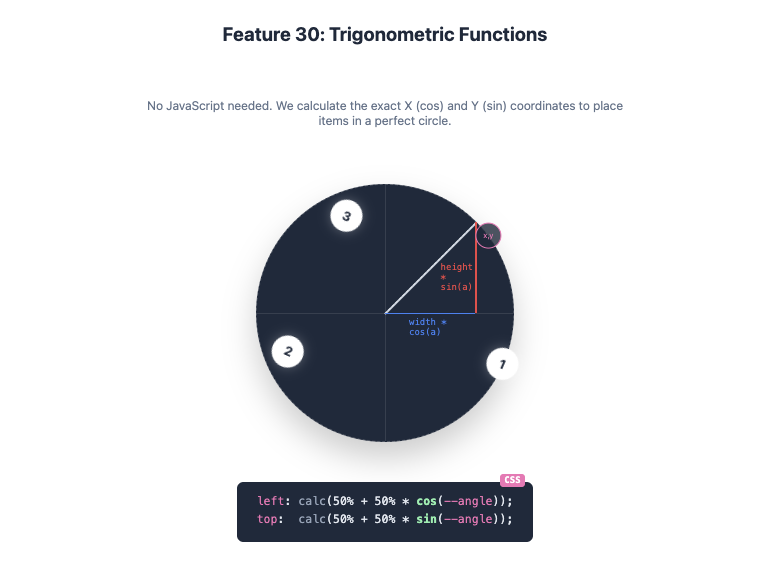
30. Trigonometric Functions (sin(), cos(), tan())
Yes, you can now do trigonometry directly in CSS! Functions like sin() and cos() open up a world of possibilities for creating complex, dynamic layouts and animations without JavaScript.
These functions let you place items in a circular pattern or create wavy animations with mathematical precision.
Combined with custom properties and calc(), you can use these functions to create things like circular menus where items are perfectly distributed around a central point. This is advanced, but it shows just how powerful CSS is becoming.
/* Example of placing items in a circle */
.item {
  --angle: calc(360deg / var(--item-count) * var(--item-index));
  transform: rotate(var(--angle)) translate(100px) rotate(calc(-1 * var(--angle)));
  /* Or using sin() and cos() for direct positioning */
  left: calc(50% + 50% * cos(var(--angle)));
  top:  calc(50% + 50% * sin(var(--angle)));
}
The world of CSS is evolving faster than ever. These 30 features are just the beginning, but mastering them will fundamentally change the way you build for the web. They make your code cleaner, more powerful, and more maintainable. So go ahead, give them a try. You’ll wish you had sooner.
Further Reading
For those who want to dive even deeper, here are some of the most respected resources in the web development community:
- MDN Web Docs (Mozilla Developer Network): The ultimate reference for all web standards, including detailed explanations and browser compatibility tables for every CSS property. https://developer.mozilla.org/en-US/docs/Web/CSS
- CSS-Tricks: A fantastic resource for practical articles, tutorials, and deep dives into everything CSS. https://css-tricks.com
- Smashing Magazine: High-quality articles and tutorials on web design and development, with a strong focus on modern best practices. https://www.smashingmagazine.com
- web.dev by Google: A great place to learn about modern web capabilities, performance, and accessibility. https://web.dev/learn/css/
- A List Apart: For people who make websites, this long-standing publication features in-depth articles on web standards and design. https://alistapart.com